UX Project: Donation Page Redesign – UI Style Guide

There are several kinds of style guide types, including brand identity guide, design language guide, voice and tone guide, writing guide, pattern library and code guide.

This style guide is only for the give site on mobile. I only have one sample page of the site, but with the style guide, it is much easier to picture the whole site with the same look and feel. Here, I want to create a professional, modern and considerate look & feel, as for creating trust from users, and warm feeling from alumni.

LOGO:

logo

logo-black

logo-reverse-color

COLOR PALETTE:

color
Color 1: For header, links, options

Color 2, For buttons

Color 3, For words

Color 4, For borders and backgrounds

Color 5, For horizontal lines, backgrounds

FONTS: Lucida Grande

font
h1 {font-size: 20px; line-height: 23px; font-weight:bold; color: CC3333;}
h2 {font-size: 18px; line-height: 21px; font-weight:bold; color: 4A4A4A;}
h3 {font-size: 16px; line-height: 18px; font-weight:bold; color: 4A4A4A;}
p {font-size: 14px; line-height: 16px; color: 4A4A4A;}
breadcrumb { font-size: 12px; line-height: 15px; color: 4A4A4A;}

OTHER ELEMENTS:

elements

Button

height: 40px
colorA: #4A4A4A
colorB: #E62E2E
border: 2px

Filling box

height: 35px
font-size: 16 px
font-color: #D8D8D8
line-height: 18px
color: #4A4A4A

Horizontal line

color: #D8D8D8
height: 2px

Call to action

Font-size: 14px
height: 40px

UX Project: Donation Page Redesign – User Research (Plan, Report, Empathy Map, Persona)

User research is the most interesting and most important part of a UX project. In this part, my aim is to understand my users, understand how they think and what they expect from the page.

First, I would like to plan my research. With the planing I would have an idea of how big the project is, how long it will take and how much resource I might need.

Look at my research plan. The research plan includes competitor research, user interview and survey.

At this point, my UX journey starts officially. I need to find users, talk to them, understand their thought, gather their opinions, and analyze their needs. Actually, the beginning part is the most challenging part.  It is not about looking for users/potential users, scheduling a meeting with them, talking to them and taking notes. It is you never know what will happen during the process, as people are always out of control.

Before this project, I had another project redesigning a page with call to actions. This project died because a user I was trying to interview misunderstood my project. As a web team member, he thought the project was a new task without his acknowledgement, so he reported it to the department boss. But actually it was only my little personal project. In the end, I was told that the project was sensitive and I did not have permissions to continue.

I explained to the user after, and he apologized not reading my Email very carefully. This is a storm in the bottle, but then I understand sometimes there could be unexpected things happen at any point of time you would never think of. Knowing it and to avoiding it as much as possible is where our experience comes from.

Finally I gathered 5 people to interview, and created a survey for more users to involve in. From the notes, I got some interesting results:

  • Female users care about the feeling of the website. They want the website to show welcome, making them feel they are important. They would love to donate if the website reminds them of the home feeling.
  • IT alumni care about security. They won’t trust the site if they don’t feel their information is safe.
  • Almost all people I interviewed said they won’t donate the amount the website suggested. But almost all people who did the survey chose an amount I gave.
  • Some people are not sure what they want to do. At first, she said she would like to donate $200, at the end of the interview, she said she would give $20.
  • Interviews always bring new information. An alumni said part of the reason why he donates every years was because of tax reasons, which as a reason I had never heard of.

I have to say it is fun doing interviews and surveys. Talking people is fun, picking up their real thought and opinions is not easy but always give you inspirations of new insights.

To know more about what I found, please review my user research report.

Based on the report, I built the empathy map and personas.

Considered that the online donation form users are mostly younger people. Senior alumni or successful middle aged people would choose to contact the university directly, instead of filling online forms. So I did not create too many personas, typical categories are alumni who just graduated  and people who graduated for a while. Their living situations and mind set might be very different, but their final goal is to help, to show their love and care.

Personas answer the question, “Who are we designing for?”. For creating personas, high quality interviews and surveys would provide richer and preciser content. Now when I look back. How many people should be interviewed and take the survey, what kind of information is valuable, what information we can infer from the answers would be clearer.

UX Project: Donation Page Redesign – Experience on Current Page 2

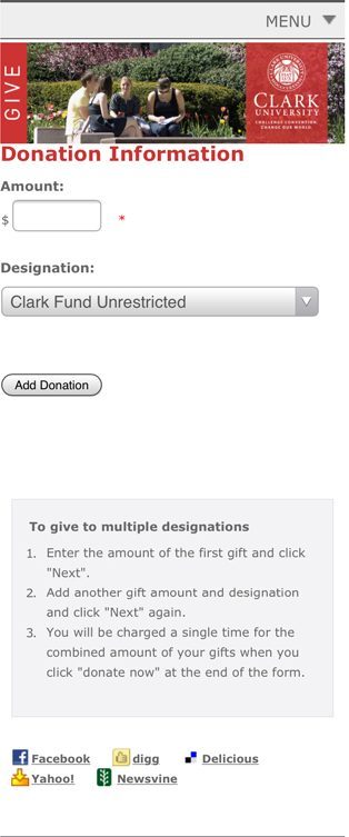
The form journey has not been ended yet. With courage, I hit the “Add Donation” button. Puff! Here is the full donation form.

The full form is very long. It is consisted by 5 parts:
> Donation Information
> Additional Information
> Billing Information
> Check-out Information
> Tribute Information

1.Donation Information

donation information
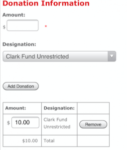
This part is what we saw in my last post. After clicking “Add Donation”, a table appears with the amount and designation. Now smart people will have a clue why the button called “Add Donation”, because it helps you build a table that you can add/delete different designations and the amount you want to give to them. The form will also show you the total amount of money automatically at the bottom.
Well, it is completely IT people’s logic, adding fields, editing numbers, submit. However, most people will not recognize that it is a multiple choice, because there is no sign telling them that your donation can go different places. “Add Donation” is not enough, and confusing people.

2.Additional Information

additional information
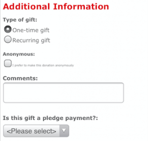
Following is additional information. When you switch between One-time gift and Recurring gift, the content will change corresponsively.

The only problem of this part is the words are too small under anonymous option. It is too hard to read for mobile users.


3.Billing information

Billing information part asks very basic information. I won’t list here.

4.Check-out Information

check-out information
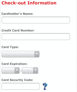
Check-out Information is the next step. What attracts attentions is the question mark beside Card Security Code. I think it is a great idea to insert explanation in the form. Some people might be terrified by certain fields, so appropriate instructions are necessary. Here, the question mark might need some redesign to conform the whole feeling of the website.

Also, if it is necessary, the form is better to be able to identify card types. Just for reducing some work load from users.

5.Tribute Information

tribute information
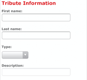
When I saw this part, I questioned that why it is here, and why I need to retype my name.

The donation system might be very complicated. There are different categories of donations, from different people, with different ways to give. We would like to present a form that shows the general information for the general users, and give clear paths to different segment users. Tribute information should not be here, listed in the main form and taking such a big space.

6.Donate!

donate buttonCompleted above, finally we are at the end of the form now.

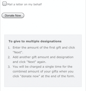
I like the option of mailing a letter on my behalf, which is forward this form to friends for loving sharing.

The interesting part is the instruction box for designation. It is now at the end of the form, again. No need to say how much space it takes here, who would know to seeking for help here? It is just a very bad idea.

7.Other problems about UX

Actually, to this form on mobile, there are other problems existing. Such as:

1. Which field is mandatory? It doesn’t address.
2. This form is too long, and no confirmation before submitting. If people input wrong info, it is even hard to find the field to correct.
3. It is not a very mobile friendly form, what was in the bigger screen disappear on mobile version.
4. Unprofessional looking form intimidates people to put their credit card information. They are more inclined to quit while filling it.

UX Project: Donation Page Redesign – Experience on Current Page

“I made my first donation to my university at the table on the day that I picked up my cap and gown. After 1 month, I saw a thank you letter was lying quietly in my mail box. From that moment, I felt I am an honored alumni. “

Most alumni might want to show their gratitude to their university by making donations. As mobile using is increasing every year, universities have to think of creating mobile friendly donation system for better connections to alumni and donors. And actually, many of them already did.

Let’s start from my school.

Here is the current give form. Filling the blank, multiple choice, add donation button and a box of instruction.

My questions are:
1, why does it say “add donation” instead of “donate now” or “make a donation”?
2, where am I going if I “add donation” as there is nothing below the botton?

Personally, I never read instruction for any device before I meet any problem while using it. Most people in my generation might be the same, we are pretty confident about figuring out smart devices.

However, with those questions, I have to look at the instruction this time.

Okay, so what does the “first gift” mean? I thought I want to only make one gift this time. And, where is the”Next” button?

There must be something wrong with the form, the instruction doesn’t seem to fit the form, which intimidate me to go on!

I want to fix it, and this will be my first UX project.


Web creation/ Digital analytics notes

why does the site exist?

1. Macro Conversion
– See from home page

2.  Micro Conversions
– call to actions

What parts of the website should you focus on first?

~ What content on the website is directly tied to driving Macro and Micro Conversions?
~ What sections of the website might be most valuable to the visitors?
~ What content areas seem very expensive to create (hence more important to measure if they are adding any value!)?
~ What cross-sells and up-sells do you see being pimped across the site?
~ What does the top nav and left/right nav groupings tell you about priorities?

How smart is their digital marketing strategy?

  1. Searching Test (use any search engine)
    5 brand-related queries
    10-15 non-brand/long tail queries
    Pay attention to:
    1. Organic search rankings (rank, page titles, snippets).
    2. Paid search ads (title, creatives, urls shown).
    3. Competition (who comes up first consistently, ppc and organic).
    4. Search Plus Your World results.
  2. Advertising from web portals
    Find high traffic websites and where your target customers are likely to visit, see if there are ads.
  3. YouTube matters (where the videos are, how do they show up, what is the quality, how helpful they are)
  4. SNS (what kind? how many followers? how often do they update? content? interactions with users?
  5. Android Market & AppStore,
  6. Phone size and tablet size friendly, Cross-browser friendly, JS can show normally.

How well are they doing in context of their competition?

www.compete.com

Google Trends for Websites

Google/DoubleClick AdPlanner

What is the fastest possible way I can have a impact on the business?

404 check, misdirection check

landing page construction check (for top organic/paid keywords, any missing important parts, wrong placement)

any related recommendation

Any technical notes I can make for the future (analytics or coding)?

descriptive link text

clean URL structures

campaign tracking parameters

check out popups

Question:

~ Use internal search engine and see if my query shows up in the url stem. For example, on this blog it would look like this: http://www.MMM.net/avinash/?s=segmentation

This would be awesome. The “s.” It means we can configure it in Analytics in two seconds (no IT begging involved) and start doing amazing internal site search analysis .

If the parameter does not exist… well, then IT begging will be mandatory.