
“I made my first donation to my university at the table on the day that I picked up my cap and gown. After 1 month, I saw a thank you letter was lying quietly in my mail box. From that moment, I felt I am an honored alumni. “
Most alumni might want to show their gratitude to their university by making donations. As mobile using is increasing every year, universities have to think of creating mobile friendly donation system for better connections to alumni and donors. And actually, many of them already did.
Let’s start from my school.
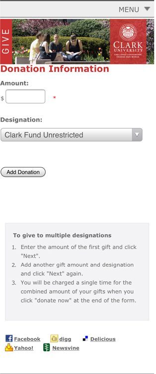
Here is the current give form. Filling the blank, multiple choice, add donation button and a box of instruction.
My questions are:
1, why does it say “add donation” instead of “donate now” or “make a donation”?
2, where am I going if I “add donation” as there is nothing below the botton?
Personally, I never read instruction for any device before I meet any problem while using it. Most people in my generation might be the same, we are pretty confident about figuring out smart devices.
However, with those questions, I have to look at the instruction this time.
Okay, so what does the “first gift” mean? I thought I want to only make one gift this time. And, where is the”Next” button?
There must be something wrong with the form, the instruction doesn’t seem to fit the form, which intimidate me to go on!
I want to fix it, and this will be my first UX project.